Visual identity
Confident, exciting and innovative
We have created an energetic brand that signals to the outside world that we are a confident, exciting and innovative university.
The brand is a visual representation of what we stand for and should help inspire people to do their best.
The identity and its system have been carefully considered, researched and tested to make sure we have created the best image for Teesside University.
How to use our logo
The logo is only used in two colours, black or white out depending on the background.


Sizing the logo
An exclusion zone is in place to make sure that other graphic material or type does not interfere with the logo. This zone equates to a space that uses the width or half the height of ‘T’. The only exceptions to this exclusion zone are where space does not permit, such as for merchandise.
![]()
The recommended minimum sizes for reproducing the logo are:
- A1 – logo size 150mm
- A2 – logo size 105mm
- A3 – logo size 75mm
- A4 – logo size 55mm
- A5 - logo size 45mm
- A6 and business card – logo size 35mm
- Email header – 150 pixels x 58 pixels
Dos and Don'ts
![]()
DO NOT confine the logo within a box
![]()
DO NOT condense or stretch the logo in any way
![]()
DO NOT alter the logo in any way
Download our logo
- Black: RGB (screen) | CMYK (print)
- White: RGB (screen) | CMYK (print)
Sub-brands
Our brand architecture details the structure and organisation of a our portfolio of brands, products, and services. It defines how different brands and sub-brands are related to one another and how they work together to create a cohesive identity.
Download our brand architecture
Colours
Gold
Pantone: 10127
C: 27
M: 36
Y: 79
K: 15
Black
Pantone: Black
C: 100
M: 100
Y: 100
K: 100
Grey
Pantone: 443
C: 44
M: 25
Y: 30
K: 0
Online
These colours have been tested for accessibility and meet the WCAG colour contrast ratio.
Gold
#867537
Black or white text can be used on top
Black
#000000
Use white text on top
Dark Grey
#333333
Use white text on top
Grey
#767676
Use white text on top
Light Grey
#CCCCCC
Use black text on top
Lightest Grey
#EBEBEB
Use black text on top
Using these colours in a template
Guidance on adding colours to word or excel
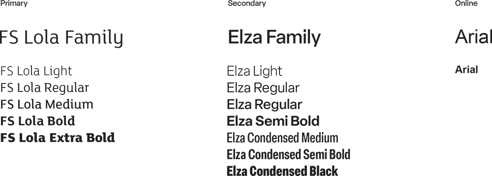
Fonts
There are two recommended typefaces for all Teesside University printed marketing materials.
FS Lola is the primary typeface to be used for front cover titles, main headings, intro paragraphs and standouts, such as student quotes.
Elza family is our secondary typeface and is recommended for body text, smaller headers and captions. This typeface is also used for our recruitment campaigns, UG, PG and London.
Arial is the defaut typeface used on online formats when the above aren’t available.